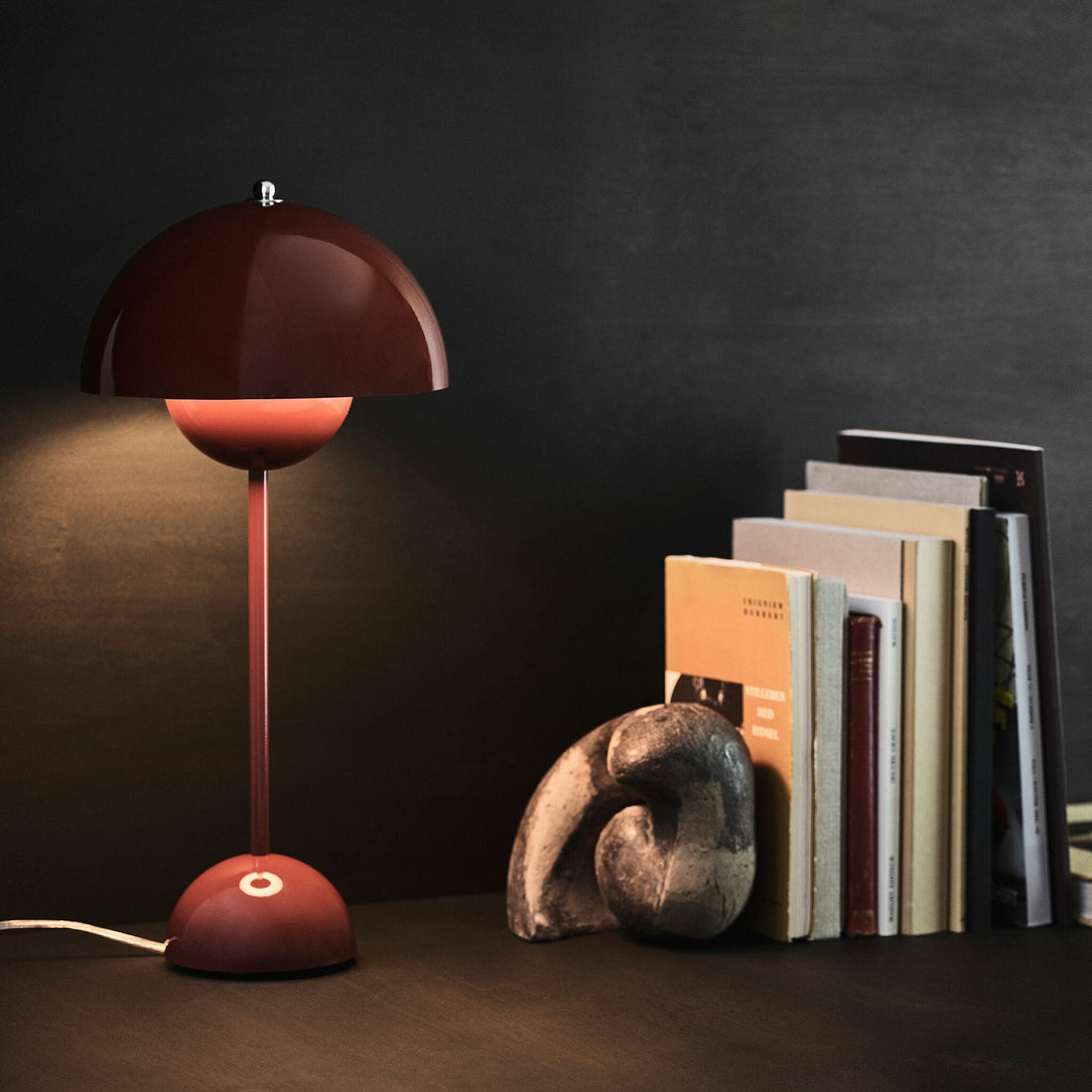
Bring colour into your home. It sounds simple, but how do you actually do it? Which colours go together, and what kind of atmosphere do they create? We'll show you five different colour schemes to help you find the right combination for your interior style and personal taste – and how to bring these palettes into your home.
Natural pastels
Pastel colours have long been a fixture in fashion and design. Soft shades such as rosé, mint green and pale orange bring colour into your home without looking busy. Pastels work especially well with white, which serves as the base colour in many interiors. The more white you use, the fresher and lighter the room feels.
Our favourite: combining soft pastels with natural materials such as wood. This creates an exciting mix of a modern, gentle colour palette and a natural, warm atmosphere.

The new black and white
A black-and-white interior looks elegant and timeless. In many modern interiors, these two colours form the basis of the whole look, and individual design pieces in black or white can be used as eye-catching features.
Graphic patterns or textured surfaces add more life. If you want bolder accents, add a strong colour to the black-and-white concept. A single splash of colour can instantly make a room more exciting.
I'm blue
Navy, violet blue, aqua, sky blue, cobalt or azure: few colours offer as many different shades as blue. That's exactly what makes decorating with blue so versatile.
Blue brings calm and freshness to a room. Dark shades such as navy or steel blue give an interior an elegant, almost regal feel. Combining different blues, for example with turquoise or light blue, creates a lively, playful look.

Grey: anything but dull
Grey is no longer boring. This neutral colour can be combined with countless other shades and materials, creating a different effect every time.
Combined with wood, it creates a warm, natural look. With white and glossy surfaces, grey looks modern and clean. With materials such as steel or stainless steel, the room takes on an industrial character.

Warmth in terracotta
Last but not least: an interior in warm orange tones. Orange is considered the colour of joie de vivre and was especially popular in interiors in the 1970s. From wallpaper and lights to home accessories, orange stood for openness and a modern lifestyle.
Today, the colour is making a comeback thanks to its retro charm. Orange looks particularly harmonious with natural shades such as terracotta, beige or warm earthy tones, creating a cosy look without making the room feel busy.

As these examples show, colours can be combined in countless ways to create very different atmospheres: warm and cosy, playful, or clean and elegant. A colour scheme helps you judge the effect of your colour choices and create a harmonious look for your home.