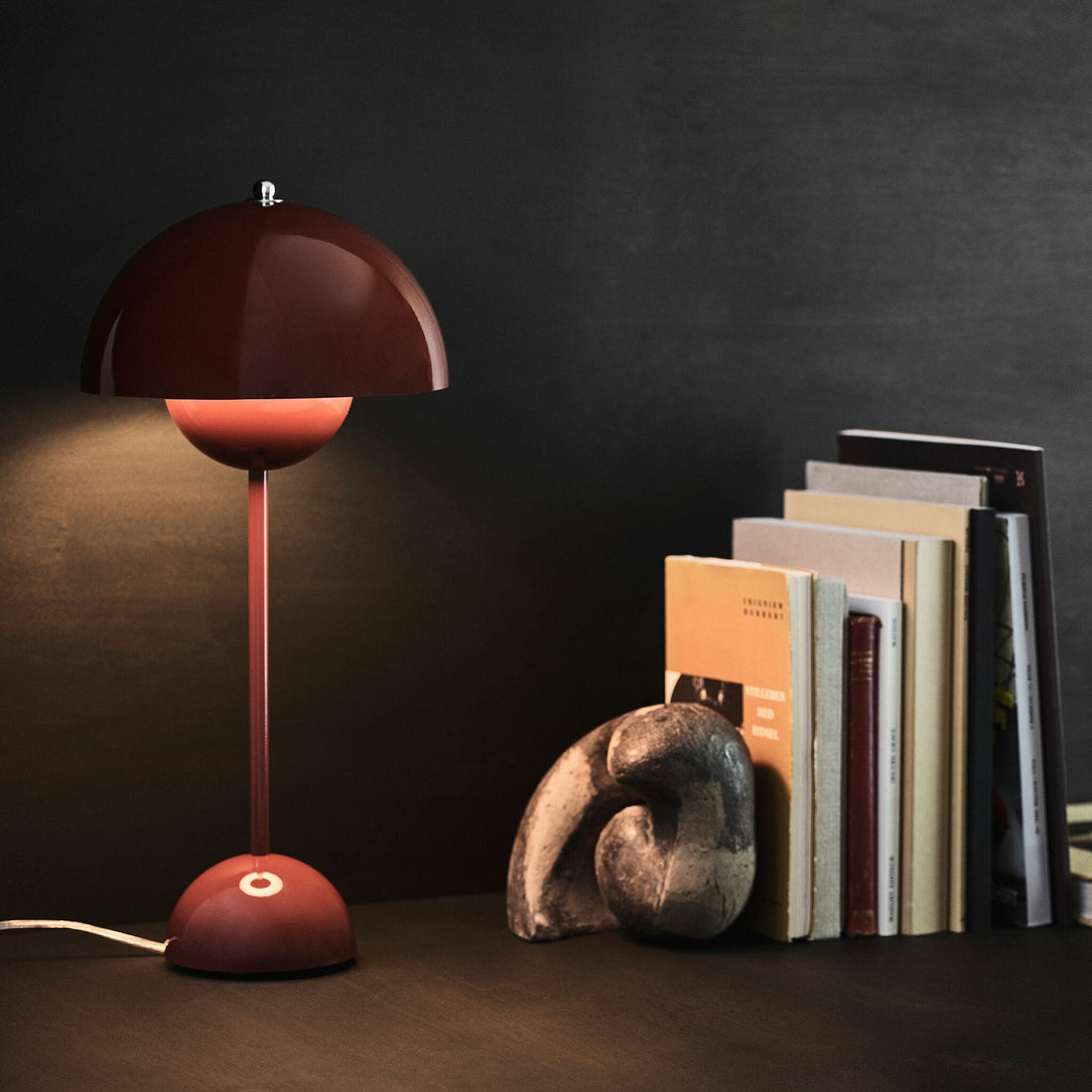
Colours change how we experience a room. They can make it feel warmer, brighter or livelier, create striking contrasts or highlight individual pieces of furniture and accessories. You don't need to repaint your walls straight away: a colourful lamp, a chair or a few small accessories can change the way a room feels.
But which colours go together, and how do you use them best? We show you the effect the most important colours have and how you can combine them in your interior.
How colours affect a room
Whether a room feels cosy, fresh or lively also depends on its colour scheme. Light colours often make rooms appear more open, while dark shades create depth. Warm colours such as red, orange and yellow feel lively and inviting, whereas blue and green usually create a calmer, more natural atmosphere.
Quantity matters too. A red sofa defines a room more strongly than a single red vase. If you'd like to introduce colour gradually, start with accessories, textiles or lamps.
Red, orange & yellow: warm and lively

Warm colours bring energy and warmth into your home. Red feels powerful and expressive, orange lively and inviting, and yellow sunny and fresh.
These shades look particularly harmonious against a calmer base of beige, cream, grey or natural wood tones. Just a few splashes of colour can be enough to give a room a whole new feel.
Green: natural and versatile

From fresh light green and muted olive to deep forest green, green offers lots of options for your interior. The colour is closely linked to nature and feels harmonious and balanced as a result.
Green combines beautifully with wood, beige and other natural tones. Pink, orange or blue, on the other hand, create a more striking contrast.
Blue & turquoise: fresh and clear

Light blue feels airy and fresh, while strong cobalt blue or dark indigo gives a room more depth. Turquoise combines elements of blue and green, which makes it particularly lively.
Blues go just as well with white, beige and grey as with warm wood tones. If you like stronger contrasts, combine blue with orange or yellow.
Pink & violet: from soft to expressive

Powdery pinks feel warm and understated and combine wonderfully with beige, brown or grey. Bright pink, magenta and violet, on the other hand, create much stronger accents.
Pink and green make a particularly interesting combination: the two colours form an attractive contrast and, depending on the shade, can look modern, playful or elegant.
Beige, brown & white: the calm base

Neutral colours are especially versatile and form an ideal basis for different interior styles. Beige and brown bring warmth and a natural feel to your interior, while white adds brightness.
To keep a neutral colour scheme from looking monotonous, combine different shades, materials and surfaces. Wood, linen, wool, glass and ceramics add extra texture.
Grey & black: clear contrasts

Grey is a versatile base that goes with almost anything. Light greys look understated, while anthracite creates more depth.
Black creates even stronger contrasts. You don't need to use it over large areas: black lamps, chairs or accessories can be enough to give your interior more definition.
Gold, silver & metallics: shimmering accents

Metallic surfaces bring shine and interesting reflections of light into your interior. Gold and brass feel warm and look particularly good with beige, brown, green and dark blue.
Silver, chrome and stainless steel feel cooler and more modern. Combined with wood, textiles or bold colours, they create interesting contrasts of material and colour.
How do I bring more colour into my interior?
If you've mainly used neutral colours so far, you don't need to change your whole home straight away. Small pieces are ideal for trying out new shades.
Cushions, throws, vases and other home accessories are easy to add or swap. A colourful lamp, a single chair or a side table makes a stronger statement. That way, you can gradually build a colour palette that suits your interior – and keep developing it whenever you like.