Article from the 2016-02-26, of Anja Beckmann
Colour Trends and How They Come About
 New year, new trends – that is as safe to say as the amen in church . Changing silhouettes in fashion, new inspirations and never seen before lifestyle phenomena, every year holds many surprises for us. Colours are subjected to fashion just like clothes and music are. With blogs, designer magazines and public exhibitions keeping us informed about which colour tones will be "in" and "out", we do not go into the new year completely unprepared.
But how can we predict what's hot? Since the eighties the professional trend researchers take care of the forecast of social change in fashion, consumption, leisure and entertainment. They try to guess on behalf of the industry what will appeal to the customer, for new fashion trends are not only a pleasant change for the consumers, they are also an important economic engine.
Meticulous observation is the main tool for trend researchers. They draw conclusions about future developments from observed changes: Once a theme is noticeably growing and is particularly evident, a trend is being hinted at. The trend researchers don’t come up with anything, they simply observe and pin point early on a phenomenon that has the potential to spread across a large section of the population.
The Colour of the Year – in Everyday Life
Even in the world of colours, experts believe that there are constant trendsetting tendencies. This includes the Colour of the Year chosen by the Pantone Institute, one of the most important authorities in the colour industry. Pantone experts “comb the world looking for new colour influences”, putting colours through an extensive selection process. Events from the entertainment industry, such as big-budget film projects and internationally significant art exhibitions play as big a role as popular holiday destinations, technological development and other socioeconomic factors
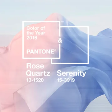 In recent years, the immigration crisis has influenced us. Since the Second World War, never were so many people seen fleeing their country as in the last two to three years, causing a cultural clash and emotional uncertainty. The Pantone Institute tried to offer a coping mechanism with its choice of colours. The pastels Rose Quarz and Serenity - chosen to overcome cultural and gender norm - were elected as
Pantones Colours of the Year 2016. Being positive colours, they offer through their softness a sense of stability and calm, but also arouse curiosity. They make us want to breathe deeply and reflect.
"Colours this season transport us to a happier, sunnier place where we feel free to express a wittier version of our real selves," explained Leatrice Eiseman, Colour expert at Pantone Colour Institute. "With our culture still surrounded by so much uncertainty, we are continuing to yearn for those softer shades that offer a sense of calm and relaxation."
This statement shows that the choices of colour trends are by no means random. The social dynamics are always taken into account and the decisions are designed to have a finger on the pulse of time.
World Affairs Influence Colour Preferences
Current world events are actually reflected on consumer’s choices of colour- for instance, after the attack on the World Trade Center, clouded was the entire colour range in the USA. The debate about climate change in recent years has increased the popularity of eco-tones such as coffee brown, light green, water blue or grey for wall paints. At least colours like pastel "Rose Quartz" and "Serenity" being socially acceptable at the moment can also be regarded as the result of an extensive analysis process and planning by trend researchers, designer’s circles and colour groups. Even though the origin of colour trends is a result of an observed tendency in consumers, as soon as the industry has forecasted it and adjusted their production to this tendency, it will be impossible to miss it.
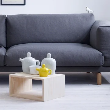
It is no wonder that fashion labels dedicate their bags, clothes and shoes to the fashion colour of 2016. It comes as no surprise that the international cosmetic giant Sephora introduced a "Colour of the Year Layer Lipstick" in the Pantone colour of the year, and that paint manufacturers added rosé and pastel blues to its range. Moreover, every year, Stelton presents his classic jug anew in the current season colours - this year in Lavender and River Blue.
Click on the images to be taken to the relevant products in the shop.
In principle, being in such a fast-paced world of colour, there are also longer perspectives. In 2010 the Dutch trend oracle Li Edelkoort - one of the most influential trend researchers in the world – announced "Yellow is the new pink! ". And with that she was referring not only to the next season, but predicted that yellow will play an important role in the next fifteen years to come. The reason for this is that yellow is optimistic, radiant and full of warmth – exactly what consumers long for.
Of course, there is no immediate mixing of the colour spectrum as soon as trend researcher Edelkoort announces that Yellow is the heir of Pink. Ultimately the consumer still decides what will thrive and what will fail as a trend, but of course our perception of colours and the available range will be affected by the reporting of trends. And if this season means many products will be available in pastel colours, one or two items might just end up in your shopping basket. We are excited!
All articles from this category Home Design News